Real estate
PWA
Project Overview
As a UX Designer at Snapdoor, my mission was to tackle one of our real estate platform's crucial challenges: improving the Pipeline Navigator feature. This tool is instrumental in guiding users through the process of listing and selling properties, which was initially overwhelming due to its complexity and poor user experience.
My goal was to simplify the user journey and make the Pipeline Navigator more intuitive and user-friendly. By focusing on user needs, embracing feedback, and continuously iterating, I aimed to create a solution that would not only meet but exceed user expectations. This involved a comprehensive redesign that addressed both visual and functional aspects of the tool, ensuring a seamless and engaging experience for our users.
About Snapdoor
Snapdoor is a leading real estate platform that simplifies the property selling process by providing tools and resources to help users efficiently list and sell their properties. Our mission is to make real estate transactions as straightforward and accessible as possible.
Objective
The primary objective of this redesign was to improve the first-time user experience on Snapdoor by overhauling the Pipeline Navigator, making it more intuitive and user-friendly. This case study outlines the journey from identifying user pain points to implementing a redesigned navigator that boosts functionality and user satisfaction.
The initial design of the Pipeline Navigator had several issues:
👉 Users felt overwhelmed by the complexity of the information.
👉 Navigational cues were unclear, leading to a confusing process.
👉 The visual design was outdated and not engaging.
Recognising these challenges, I aimed to create a solution that would simplify the user experience while maintaining the comprehensive functionality required to manage real estate listings effectively.
Understanding the Problem Space
Leveraging insights from user feedback, it became clear that the key to enhancing the Pipeline Navigator was to streamline the user journey. Users required a more straightforward way to navigate the listing process, with less confusion and more support. This necessitated a complete rethink of how information was presented and accessed.
By reorganising the interface and simplifying the navigation, I aimed to create a more intuitive experience. This meant focusing on clear, concise information and providing better support at each step of the process. The goal was to reduce cognitive load and make it easier for users to progress through their tasks efficiently and confidently.
Iteration 1: Simplification of Snapdoor's Pipeline Navigator
Objective and Approach
The initial phase of redesigning Snapdoor's Pipeline Navigator focused on tackling the immediate visual and functional clutter present in the existing interface. My aim was to simplify the navigation structure to improve user focus and minimize visual distractions, which were significant obstacles to a seamless user experience. By addressing these key issues, we aimed to create a more intuitive and engaging interface for our users.
Research and Discovery
Before diving into the redesign, I conducted a thorough evaluation of the current system. This involved collecting quantitative data from user analytics to pinpoint where users most frequently encountered difficulties, and qualitative data from user interviews and surveys to gain insights into their experiences and frustrations. This dual approach ensured we had a comprehensive understanding of the issues at hand.
Research and Discovery
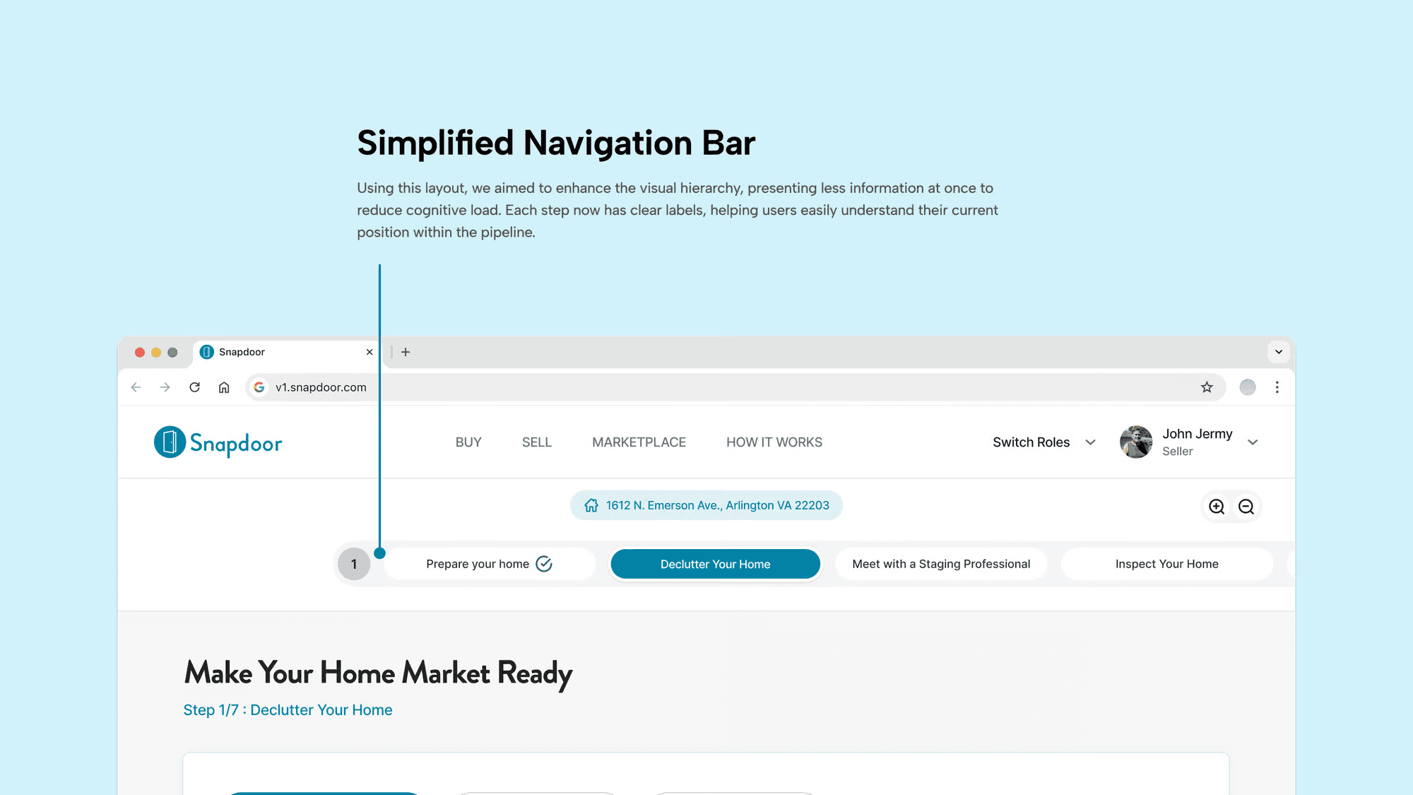
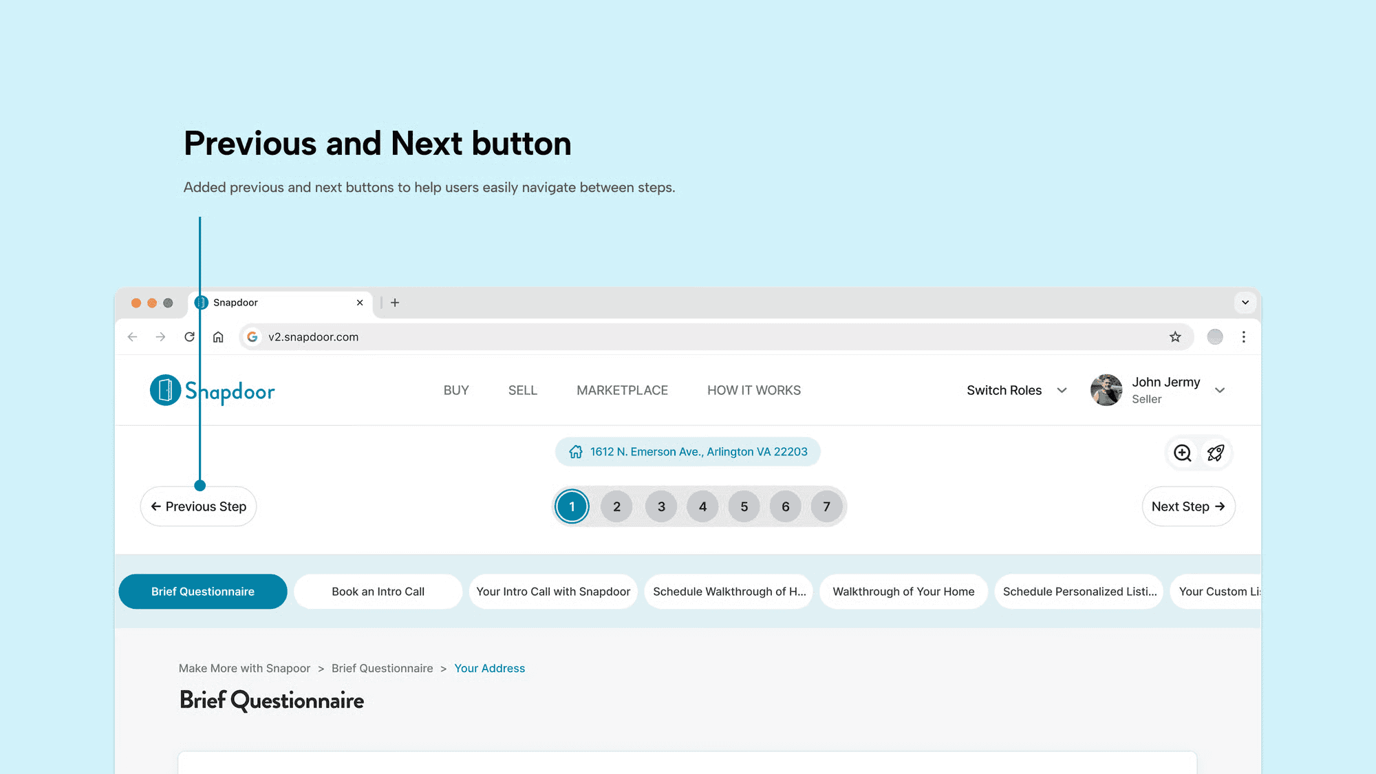
Streamlined Navigation Bar: I replaced the original vertical navigation bar with a horizontal layout. This change not only modernized the look and feel of the navigator but also adhered to best practices in web design, which indicate that horizontal navigation bars are more intuitively accessible and less cognitively demanding for users.
Intuitive Step Indicators: Each step in the pipeline was clearly labeled and accompanied by intuitive icons, making it easier for users to understand at a glance. This was a significant improvement over the previous design, which relied heavily on text and lacked visual cues that could quickly communicate the purpose of each step.
User Feedback and Adjustments
After these changes were implemented, we conducted a new round of user testing to gather feedback on the improvements. While users appreciated the cleaner interface and found the horizontal step navigator easier to interact with, they still expressed some difficulties with navigating between steps, particularly when trying to move backwards or skip ahead to non-consecutive steps.
This feedback highlighted the need for further refinements to ensure a seamless user experience. It became apparent that while the visual and structural improvements were a step in the right direction, additional enhancements were necessary to fully address navigation challenges and support user needs more effectively.
Outcome of iteration 1
Iteration 2: Enhancing Navigation in Snapdoor's Pipeline Navigator
Objective and Approach
Building on the insights gained from the first iteration, we focused the second phase of the redesign on further improving the navigational experience within Snapdoor's Pipeline Navigator. Our primary goal was to make the navigation between steps as intuitive and seamless as possible, ensuring that users could easily move forward or backward without confusion or frustration.
Research and Discovery
The feedback from the first iteration revealed that, while the visual simplification was beneficial, users still faced challenges navigating between steps, especially when trying to access non-consecutive steps or revisit previous information. In this phase, we aimed to address these specific navigational pain points.
Design Changes Implemented
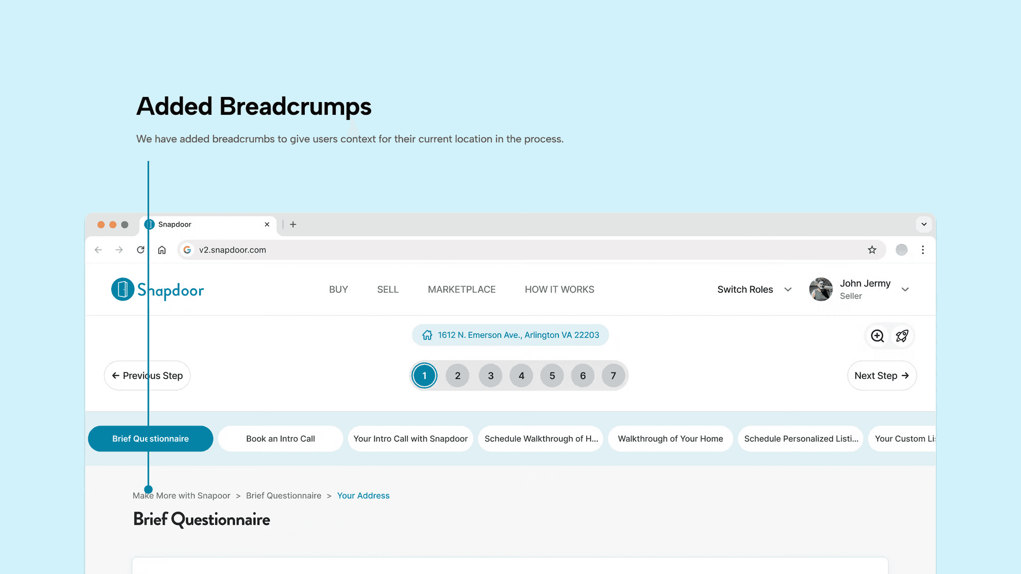
Breadcrumbs: Implementing tooltips and breadcrumbs provided users with context for their current location within the process and hints about how to use the interface effectively. These elements were particularly helpful for new users or those less familiar with digital interfaces, as they offered on-the-spot guidance without cluttering the main interface.
User Feedback and Adjustments
Outcome of Iteration 2
Iteration 3: Refining Information Architecture in Snapdoor's Pipeline Navigator
Objective and Approach
The third iteration aimed to address the remaining issue of cognitive overload by restructuring the information architecture of the Pipeline Navigator. Our goal was to compartmentalize information into main steps and detailed sub-steps across two separate screens. This approach intended to simplify the user's cognitive process by presenting only the necessary information at each stage of their journey.
Design Strategy
Based on the feedback from the previous iterations, it became clear that users needed a more manageable way to process information without feeling overwhelmed. I proposed a two-screen approach:
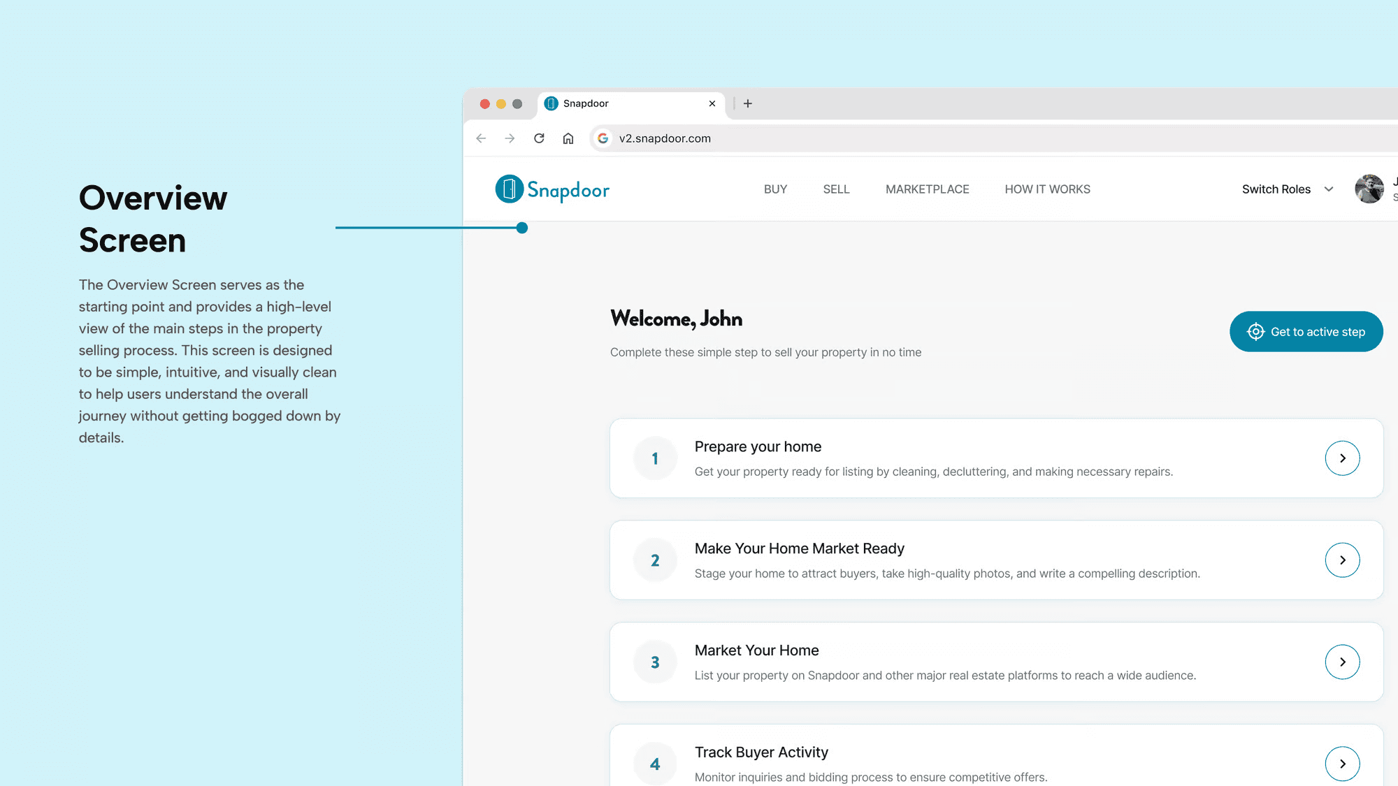
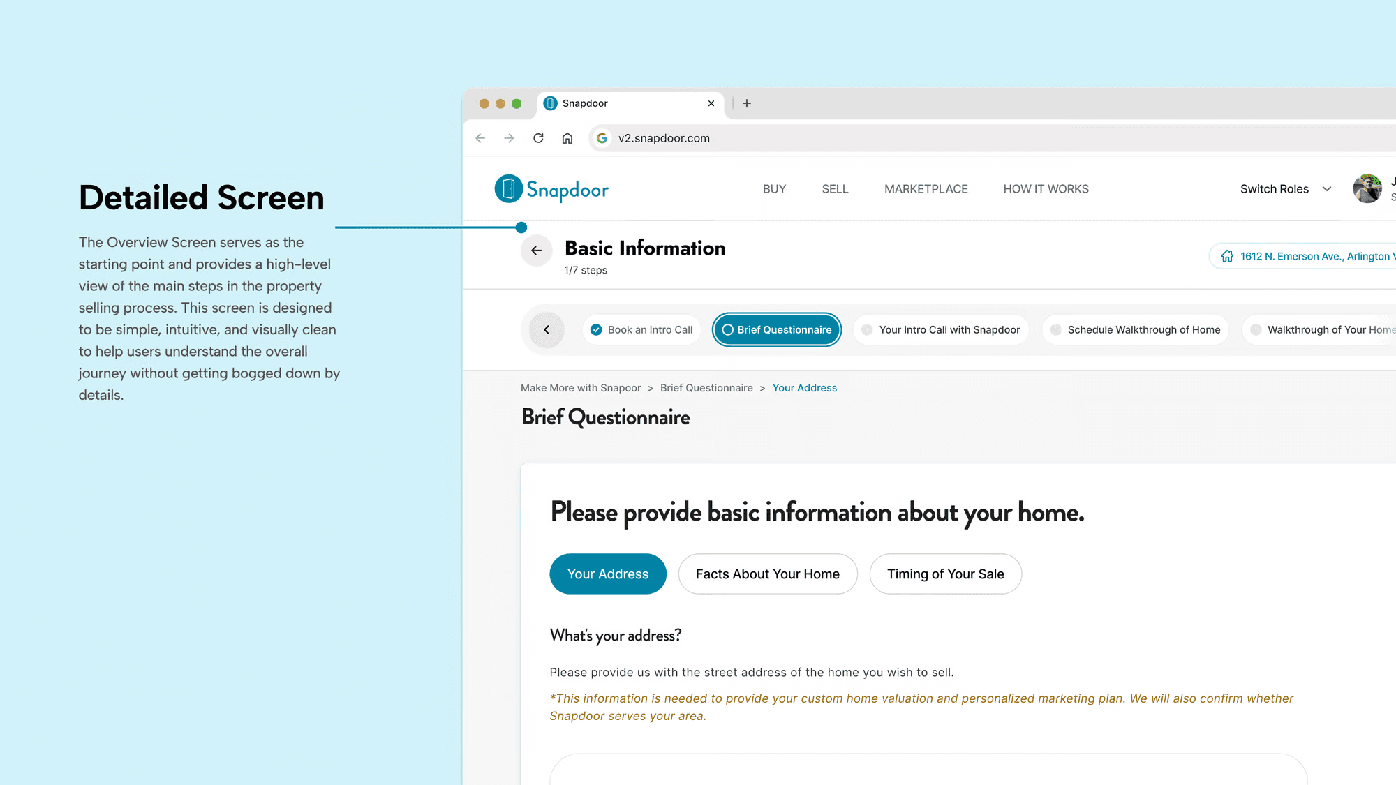
Overview Screen: This screen would provide a high-level view of the main steps in the selling process. Each step would be clickable, leading to a more detailed view.
Detailed Screen: Once a user clicked on a main step, they would be taken to a second screen where detailed sub-steps and related actions for that main step were displayed.
Implementation and Features
Dual-Screen Navigation: The first screen served as an interactive dashboard that provided an overview of the entire process, enhancing user orientation. The second screen offered in-depth content tailored to each part of the user’s journey.